Web Design
TAMA caffè
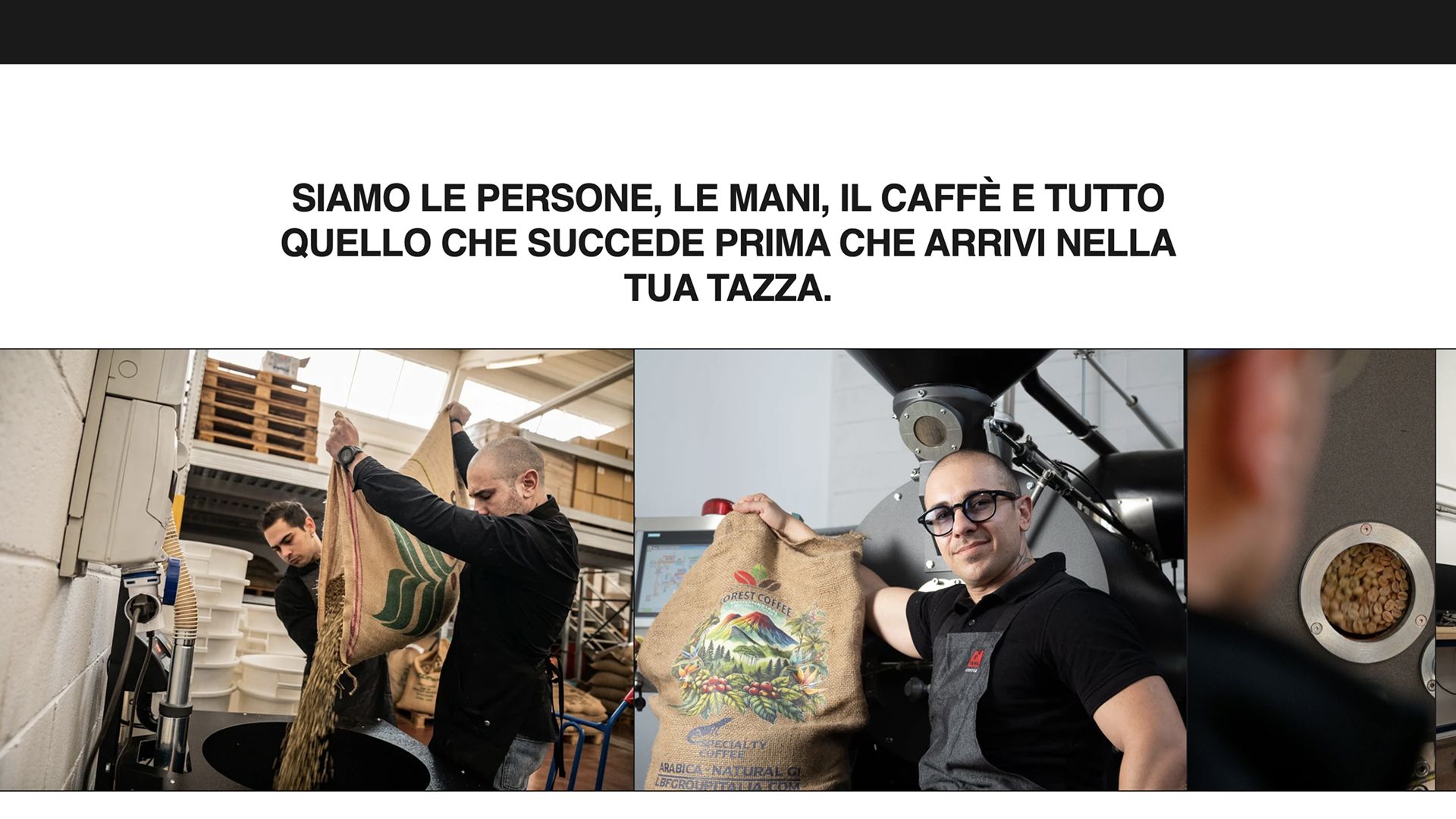
TAMA Coffee is an artisan roastery with a national following. Its previous ecommerce didn't match the roaster behind it: dated navigation, a catalogue that was hard to explore, and a backend that slowed down every marketing operation.
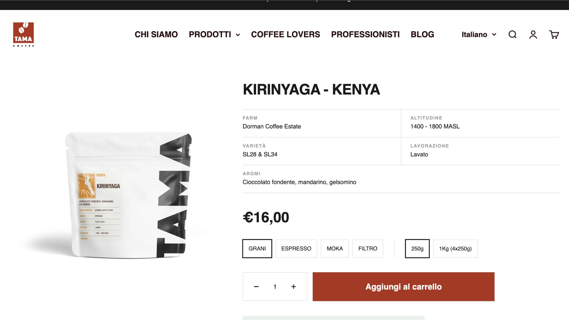
The redesign starts from the main point of friction, product discovery. Four product families with different purchase logics, from specialty single origins to compatible capsules, called for distinct paths and a product page able to carry technical depth without pushing the decision away. Beneath the interface, a data structure built so the team can update content and product details on their own. The site becomes an operational tool instead of a dependency.
Twelve months after launch, sales had grown by 200%.
Keep reading
TAMA Coffee is an artisan roastery with a national following. Its previous ecommerce didn't match the roaster behind it: dated navigation, a catalogue that was hard to explore, and a backend that slowed down every marketing operation.
The redesign starts from the main point of friction, product discovery. Four product families with different purchase logics, from specialty single origins to compatible capsules, called for distinct paths and a product page able to carry technical depth without pushing the decision away. Beneath the interface, a data structure built so the team can update content and product details on their own. The site becomes an operational tool instead of a dependency.
Twelve months after launch, sales had grown by 200%.